Showing posts with label self-publishing. Show all posts

Monday, September 4, 2023

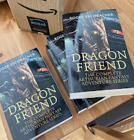
NOW AVAILABLE! Dragon Friend (The Complete 3 Book Arthurian Fantasy Adventure Series)

Dragon Friend (The Complete 3 Book Arthurian Fantasy Adventure Series)
Join Leonard in this action-packed, magic-filled, 3 book series. Watch as he befriends dragons, battles giants and monsters, and clashes with an evil secret society of dark wizards and witches who want to destroy Leonard's family and everyone else he cares about!

This new 3 book collection contains the following Dragon Friend
novels:

Dragon Friend is an epic YA Arthurian fantasy novel sure to delight readers with its unique blend of magic, dragons, and irreverent humor. When the fate of Camelot rests in the hands of a lowly page, Leonard, he embarks on a daring quest to find the legendary wizard, Merlin, and rescue King Arthur from imprisonment. As he navigates a dangerous world of hungry monsters, wicked villains, and grumpy dragons, Leonard must use his wits to restore peace and honor to Camelot.

In
Giant Killer, Leonard continues his daring adventures on an all-new, danger-filled quest. Made a Knight of Camelot by King Arthur himself, young Leonard enjoys a life of peace and prosperity in the Green Valley. He deserves it after all he went through in Dragon Friend. But has he gotten lazy and let his guard down? The answer to that question smacks Leonard hard in the face when his beloved Glennys is kidnapped by a cruel giant and taken to a mysterious kingdom in the clouds. Leonard calls on his old friends Merlin, Hubert, Ham, and a new friend, a young dragon named Taddy, to join him on this desperate rescue mission. Can this unlikely group of heroes save Glennys in time? Follow their path as they face giant-sized forces of evil and discover the awesome powers of bravery and friendship.


Elven King
is Leonard's most daring and exciting adventure yet. A battle of epic proportions awaits our hero as he and his allies rush to save the notorious Claws Crimson. Lord Crimson is the much-feared ruler of the mysterious Dark Elves and Leonard's own grandfather! But wait. Isn't the old elf a cruel and dangerous warlord? Why should he help someone as awful as that? Merlin assures Leonard that his grandfather isn't evil, just, uh...misunderstood. As Leonard and his friends travel through the dangerous worlds of Viking mythology, the stakes grow ever higher, and now Leonard must fight to not only save his grandfather's kingdom, but the family he never knew he had.
**
Roger Eschbacher lives in Los Angeles with his awesome family, a hilarious Border Terrier, and a sweet little Russian tortoise.

In addition to writing fantasy and sci-fi adventure novels, he writes TV animation for Warner Bros., Netflix, Cartoon Network, Hasbro Studios and more. Roger’s YA space opera Ghost Star is a winner of the Kindle Scout competition and received a publishing contract from Amazon’s Kindle Press imprint.

Dragon Friend (The Complete 3 Book Arthurian Fantasy Adventure Series) and other books by Roger are listed and available for purchase on his Amazon Author Page.

#Arthurian #norse #fantasy #fantasynovel #Kindle #paperback #complete #bookseries


Sunday, July 26, 2020

Busy Busy Busy!


Been super busy the past couple of weeks. I finished the “final” edit of the Elvenking: Leonard the Great, Book 3 manuscript ("final" is in quotes because, as my fellow authors know, you're never really finished). Now formatting/reformatting the interior of all three books in the series with a new design template from Book Design Templates - it's super easy to use and looks great.

New covers for Dragonfriend, Giantkiller AND Elvenking should be here by the end of the month. Exciting (for me, anyway)!

Waiting in the wings: Full novel version of Undrastormur and completion of the first draft of Ghost Star 2 (don't have a name for that one yet)!  Doing my best to stay positive and make this crazy year as productive as possible! #fantasy #scifi #author


Wednesday, December 4, 2013

I'm in a Wonderstorm!

Well, technically, I have a story in Wonderstorms, a new fantasy anthology that's coming out in the next week or two (sometime between 12/10-12/20). That's right, I finally have something new being published. Stop laughing. I'm a busy guy!

We five authors were given the challenge to write a short story based on the book's title. The only other stipulation was that it had to be fantasy-based. That's all we got. And so I sat down at the end of September and began working out Undrastormur (a cobbled-together Icelandic phrase that translates to. . . care to take a guess? You got it. Wonderstorm.

Icelandic, you say? Yes! My story has trolls, a draugr (the Viking equivalent of the walking dead), a bold shield maiden, and a couple of galdrakarls (Norse wizards). I'm very pleased with how this anthology turned out (all the stories are quite good) and hope our readers enjoy it, too.

I'll share more details as they become available. In the meantime. . .stop laughing!

Friday, August 30, 2013

Soon-ish

Earlier this week I posted the following update for backers of my old Dragonfriend Kickstarter project. I offer it here for those patient souls who have been asking me "When is the next book coming out?" Translation: "When are you going to publish it you dope?!" Here is my vaguely specific and "waffle-y" response:

"Hi folks! I just wanted to give you a quick update on the status of Giantkiller -- primarily because some of the Dragonfriend backers are owed a copy of the new manuscript in one form or another, but also because I'm excited about getting closer to an actual publication date.

Just this past weekend, I was finally able to send off the Giantkiller file to the same pro editor who pummeled Dragonfriend into shape. Iguana Proofreading's Darren Robinson informs me that he should be finished critiquing and proofing the book sometime in the next three weeks! I'll review his suggested edits (which have been dead on and saved me from some embarrassing errors on Dragonfriend -- exactly the reason I did a "Help me hire an editor" Kickstarter project), make the necessary changes, then format and upload the book. Hooray!

I'm not going to give an estimate as to when all of this will be finished because I'm always wrong when I do. Suffice it to say it will be "soon-ish."

Thanks again for your support of the original project. As I mentioned in the project proposal, any leftover funds would be used on the sequel to Dragonfriend. Between purchasing the cover art and hiring Darren again, that's exactly what happened."
 My excuse for the delay is that I've been blessed with some great animation work and while there is no downside to being fully employed, it hasn't left a lot of time for Giantkiller. That said, I promise to keep chugging along and deliver the book to you in a "soonish manner." Which, in this case, I hope, means before the end of the year.

...waffle waffle waffle...

Tuesday, January 10, 2012

Dragonfriend Postcards and Bookmarks

Hot off the presses, these beauties arrived early last week. Designed by the excellent Mike Wykowski, I love how they turned out and look forward to giving them out at readings and signings. Penguin sprang for a bunch of postcards for my picture book, Road Trip, and I was surprised at how helpful they were in terms of generating reader interest. I mailed them out to bookstores and left stacks of them at places where there were likely readers -- libraries, bookstores, schools, churches, etc. -- and received invitations to read/sign from these places as well as some mentions of postcard inspired purchases on my website.

Naturally, I had to have some postcards for Dragonfriend and, as publisher, made the savvy executive decision to have some bookmarks printed, too. Yeah, that's me, savvy.

Got any promotional suggestions you'd like to share? Please leave them in the comments.

Thursday, November 17, 2011

Dragonfriend is Now on Smashwords

Set up a Smashwords account last night. It was pretty easy to do although they are sticklers for what they consider proper formatting. Not saying they shouldn't be, they just like things the way they like them. The good thing is that they lay everything out for you in their style guide and quickly bounce back an error report if their "autovetter" finds some formatting it doesn't like. All free, too.

So in addition to the Amazon and B&N accounts, thanks to Smashwords you can now read an ebook of Dragonfriend on these devices, too: Apple iPad/iBooks, Sony Reader, Kobo, and most e-reading apps including Stanza, Aldiko, Adobe Digital Editions, others.

And there was much rejoicing.

Friday, October 14, 2011

"Fortune and Love Favor the Bold" aka "Go For It!"

Ovid
I think every author knows that a nice blurb, praise from a well-respected peer, can help potential readers make up their minds about whether it's worth taking a chance on a book. Because of this, I asked two mg/ya fantasy authors, whose work I greatly admire, to blurb Dragonfriend and was delighted when they agreed. I hope they don't mind me sharing their blurbs prior to publication.

Keith Robinson (author of the awesome Island of Fog series) wrote:

"Dragonfriend starts with a chuckle then quickly develops into a brave quest, climaxing in a truly epic battle between knights, dragons and fiends from Hell. Honestly, what more could you want?"

Wow. And as far as blurbs go, there's absolutely nothing more I could want!

Carolyn Hennesy (author of the delightful Pandora series) wrote:

"A clever, witty and wonderfully written side story to the Arthurian legend. Eschbacher has given never-considered twists, turns, fun details and tremendous heart to a world so often painted with a chivalrous but rather drab brush. Leonard is a marvelous hero-in-the-making and Mantooth is the first dragon in a long time who really deserves a hug."

Wow, again. Humbling praise!

The thing is, I wouldn't have gotten these great blurbs if I hadn't pushed aside my reticent nature, swallowed my congenital discomfort at requesting a favor from a "stranger," and just asked (in an extremely polite and professional manner).

Traditionally published books have the advantage in this area in that the publisher is the one responsible for securing blurbs from relevant authors. Obviously, we independent authors don't have this advantage and have to do the footwork ourselves. This can get kind of tricky and downright uncomfortable for the prospective "blurber" as they are dealing directly with the book's author, the "blurb-ee." What if they end up hating the book and don't want to give a blurb? Awkward? To say the least! The blurbers have every right to say "no thanks" and would be quite justified in doing so.

That being said...

"Fortune and love favor the bold," is one of the quotes I use to motivate myself to attempt to accomplish good things that make me feel uncomfortable (see the above congenital defect). It's from Ovid, the Roman poet, and is basically a fancy way of saying, "Go for it!" Independent authors have to do this time and time again during the arduous process of bringing their book to publication. Heck, the very decision to self-publish is a major "Go for it!" moment. So, while I'm not saying you should start bugging authors for blurbs in a creepy, stalker-ish manner, I am saying that if you've developed a sincere and honest online relationship with an author whose work you respect, there's nothing wrong with asking them for a blurb. Just don't take it personally if they say "No, thanks."

Any thoughts or tips on the art of the blurb? From both sides of the equation? Share them in the comments!

Wednesday, September 7, 2011

Proofers Activate!

Proofer in Action
As of today, all the proof copies for Dragonfriend have either been mailed out or hand delivered to shadowy figures across the land. Known to me as "Proofers," I await their feedback with bated breath. They are my last, best hope for an error free read.

After their changes are made, it'll be time for final tweaks on the interior and cover design, another "final" proof copy and then, Then, THEN...a vigorous smackdown on the "Approve" button! In the meantime, I'm working toward completing the first draft of the second book in the series (so expect to see some movement on the long-neglected progress bar to the right).

Elsewhere in the news, I have an irresistible urge to list my top three favorite Pixar films:

1. The Incredibles: One of the best animated films of all time and the top of my Pixar list due to superb animation, voice casting, and a top notch script. (Side note to Brad Bird: Please come up with a story idea you like and do the sequel. NOW!)

2. Monsters, Inc.: Hilarious, full of heart without being schmaltzy, a completely original setting. Works on every level and like all of the top Pixar films is infinitely re-watchable. I'm very happy they're doing a prequel to this one.

3. Up: Great characters, fun story, and heart -- the magical mixture that Pixar seems to be the best at doing (notable exception: Dreamworks' Kung Fu Panda -- so good I have to keep reminding myself it's not a Pixar project).

So there you have it. How does my Pixar list compare to yours?

Wednesday, June 8, 2011

Good Grief, I'm a Font Nerd

I came to that (possibly sad) conclusion yesterday after spending most of the day trying to decide which font I'll use for my novel, Leonard the Great: Dragonfriend. As I've mentioned before, when you self-publish, you have to do everything -- including formatting and choosing the font for the interior pages of your book. There are very talented professionals in traditional publishing whose only job is to do just that so you know the importance the big guys attach to this part of the publishing process. They're called Book Designers and they (the good ones, anyway) live for their craft, delighting in choosing just the right font for a particular book. Check out this cool little collection of video shorts from Penguin to get an idea of what I'm talking about. These folks are passionate!

While I'm not as energized by the subtle differences between Arial, Helvetica, or Georgia, I did totally key in to the importance of font choice. A lot of the pros use pricey custom fonts with names like Minion, Bembo, and Gotham that are purchased from font or type "foundries." These days custom fonts are largely designed at corporate entities like Adobe or Apple, but a surprising number are still created by much smaller companies and individuals. To give an idea of the costs involved, Adobe currently lists their "Font Folio 11" (with over 2300 fonts) for $2599.00. An individual font like "Adobe Caslon Pro" currently costs $169.00. Why so expensive? I'm guessing it's because the designers not only had to create individual numbers and letters for each font in its "regular" form, they also had to do their complete alphabet in italics, bold, bold italics, and so forth. That's a lot of design work.

A large publishing company can justify dropping that kind of cash to make their books look "just right," but that's definitely out of my league. The good thing is that even the lowly Microsoft Word foundry has a fairly impressive array of fonts to choose from -- for free (well, not technically, but you know what I mean).

Conventional wisdom holds that large blocks of printed text are easier to read when in "serif" form. With a serif font (Times New Roman, Bookman Old Style, etc.) you get letters with little flourishes or "semi-structural details," a letter with "feet," for example. Sans serif fonts (like the aforementioned Helvetica), on the other hand, have none of these embellishments and are considered easier to read on your computer screen because of their simplicity. Side Note: This blog's composition font (what I see when I'm writing it) is serif but its display font (what you see when reading it) is sans serif. I have no idea why Google does it this way.

Since I was choosing the text font for a printed book (which includes the Kindle edition with its "virtual ink" technology that, even though it's digital, is seen by your eyes as a regular printed page and not a "screen"), I stuck with the numerous serif fonts available. I formatted my novel in a 6x9 configuration (the eventual "trim" or final size), single spaced, and "justified" on both sides. I have to say that it was no small thrill to see my little manuscript properly formatted for print -- it looked just like a "real" book! Next I did "select all" and applied the serif fonts to the manuscript pages, one at a time. Wow! Talk about cool. Yes, it was about this time that the "font nerd" term came to mind.

The differences were subtle yet impressive. MS Word's default font is "Times New Roman" and using this one, the manuscript came out to 248 pages. Because of seemingly insignificant attributes like letter size and spacing between characters, other fonts dropped it down to as low as 234 or pushed it all the way up to 309! I had done a little internet hunting to see what fonts professional book designers and other self-pubbed authors were using and if those fonts were listed in Word, I gave them a shot.

I chose eight serif finalists that seemed to offer visual appeal and that elusive "readability" factor. If you think I'm making too big a deal about this, think about the times you may have had difficulty getting through a book even though you were enjoying the content. This usually happens to me with sci fi paperbacks from low-end publishers who end up reducing their fonts to the smallest readable size possible with minimal spacing between characters, sentences, and paragraphs. They do this to save money as more pages means higher production costs, but the end result is a high degree of unreadability that sometimes makes it seem like I'm looking at a solid page of side by side letters rather than words and sentences. That's what readability is all about -- a pleasant-to-look-at font on a properly formatted page.

The finalists included Book Antigua, Goudy Old Style, Bookman Old Style, Georgia, Century Schoolbook, Baskerville Old Face, and Palatino, but, ultimately, I went with Garamond (created by sixteenth century type designer, Claude Garamond), 12 pt with 1.15 spacing between lines. Here's a sample:
"Leonard felt that he had truly lost his mind when he found himself jumping over the bridge wall and sliding down the muddy banks of the Smellet River toward a very large dragon that he really didn’t know at all."
As you can see, it's a "friendly" font with good spacing between individual letters/words and a high degree of readability. I really like it.

Should this post be taken as an expert treatise on font selection? Heck no! I basically stumbled around until I found something that worked for me. But if you're an independent author who's having to design your own book's interior, I do hope that you'll give font selection the attention it's due.

By the way, after all that exploration and experimentation I decided to see what font was used in the Harry Potter books since they have the same target readership as Leonard. 12pt. Adobe Garamond! I'm not sure how Adobe's Garamond differs from Microsoft's (enough to be proprietary, obviously), but I couldn't tell the difference and as far as I'm concerned, what's good enough for Ms. Rowling's little trifle is good enough for mine!

Got any font or formatting love to share? Leave your thoughts and tips in the comments.

Thursday, May 26, 2011

Getting It Right the First Time

YA author/blogger Angela Scott has a great post on why it's so very vital to make the best first impression possible with your self-published novel. She says:
"I would think, with the prejudice that self-publishing experiences, that someone contemplating that route would do EVERYTHING, going above and beyond what is even necessary, to prove people wrong and produce a perfect, polished piece of work. But they’re not."
I couldn't agree more and probably err on the side of over-caution for fear of putting out something that looks amateurish.

Angela also offers a few tips on what to keep in mind before pushing the "publish" button. Check out the full post on her blog.

Personally, I'm a big fan of beta-readers (asking writerly/well-read types whose work I respect to take a look and gives notes - which I'm then smart and humble enough to follow). Even with all their help, I still recognize the importance of hiring someone who has the sole responsibility of catching all the dumb mistakes that I know still exist in my manuscript (even after some 10+ self-edits). That's why my first-to-be-self-published manuscript is currently with a professional editing/proofreading service.

Got any tips of your own? What kind of things do you try to take care of before putting your manuscript out there on the open market?

Monday, May 23, 2011

To the Editor!

Just a quick update to let you know I sent the manuscript for Leonard off to the editing service, yesterday. Hooray! I opted for their full-service treatment which not only includes a proofread (punctuation, grammar, etc.), but also a more detailed edit and overview. A professional edit is the main reason I launched the Kickstarter project so it's truly a thrill to finally get the ball rolling in that department.

My editor told me I could expect to get it back in around three weeks, possibly sooner. Once that happens, I'll make the suggested changes, then start cranking on getting Leonard the Great: Dragonfriend listed on Amazon, both in Kindle form and as a physical book.

In other news, steady progress is being made toward completion of the first draft of the sequel to this book. On Friday, Leonard was swallowed by a monster. Hope he survives. ;c)

My 2024 Walk to End Alzheimer's Fundraising Page

My mom, Pat, suffers from Alzheimer's/dementia. This horrible disease is aggressive for some sufferers ...